PROJECT DELIVERABLES
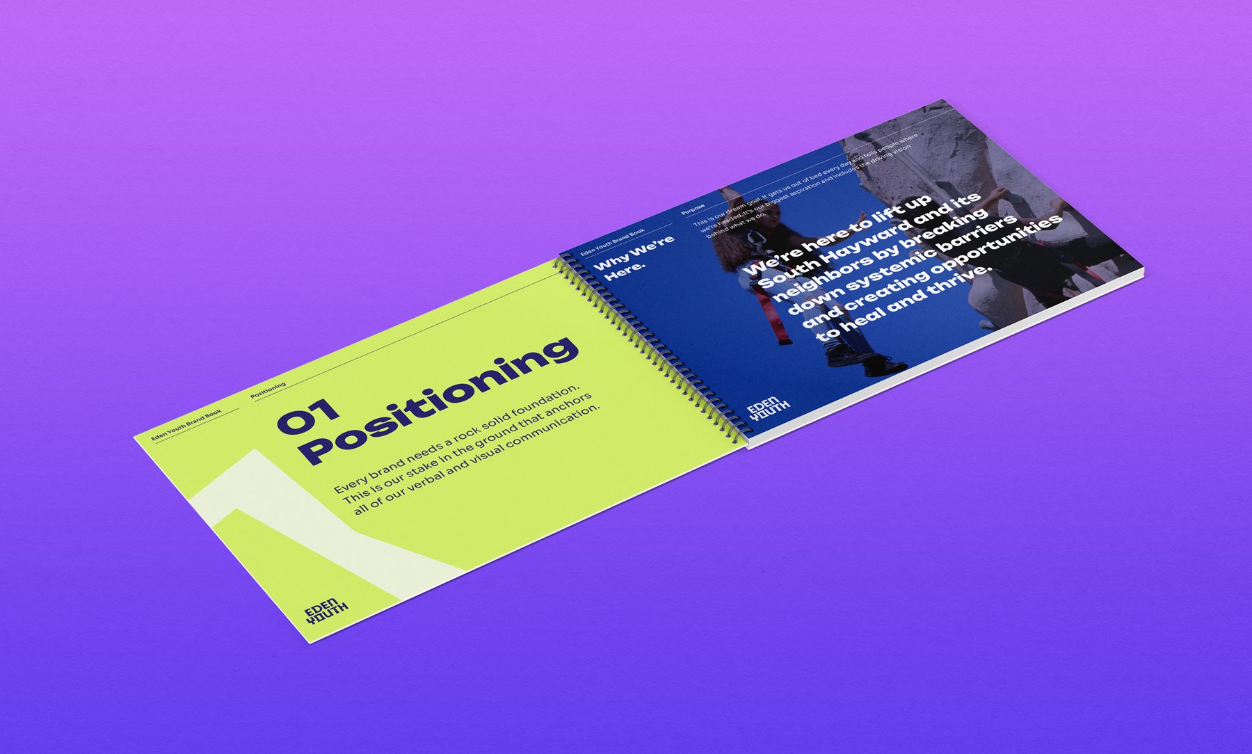
Brand Positioning
Brand Identity
Tagline
Custom Logo Type
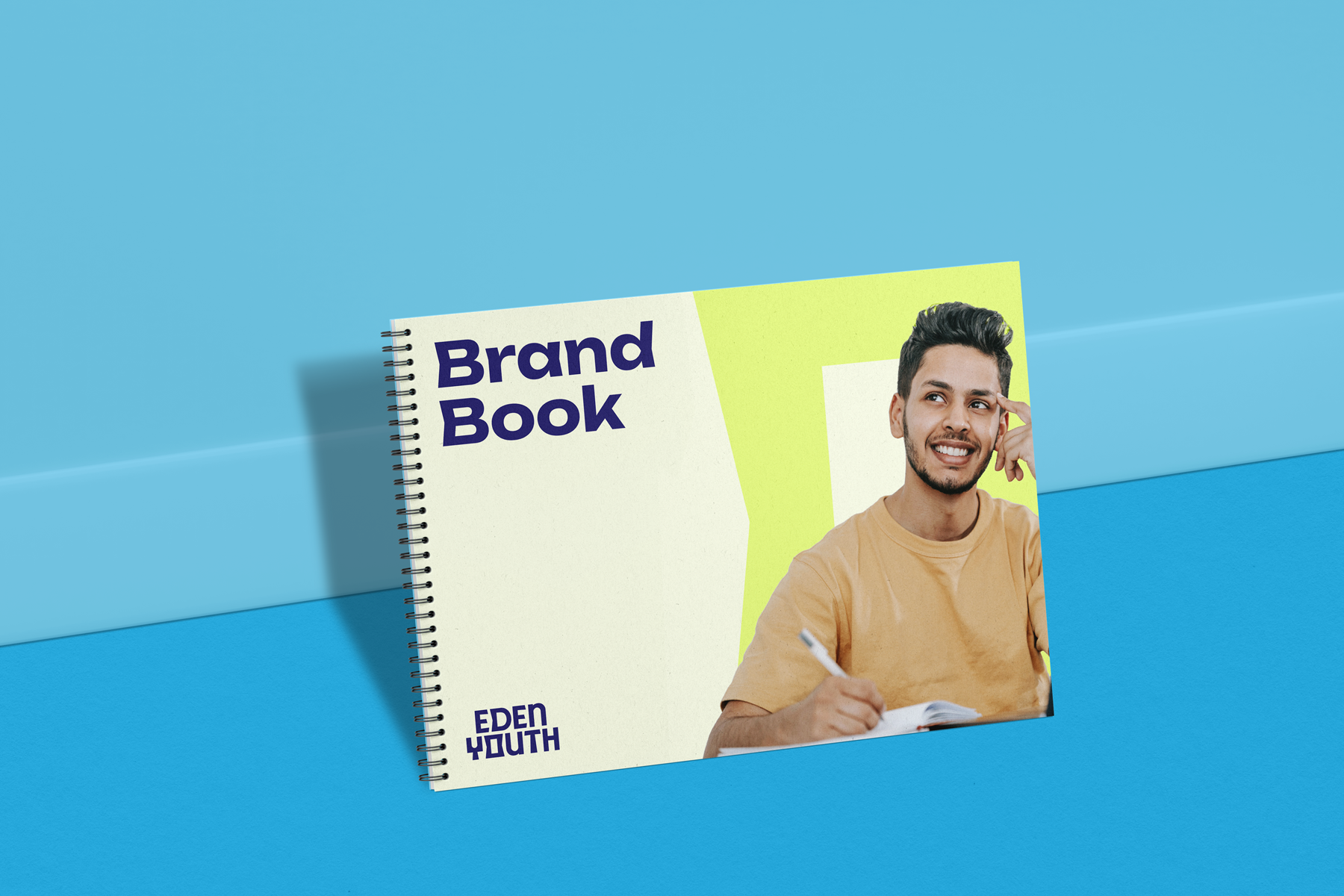
Brand Systems & Guidelines
Art Direction
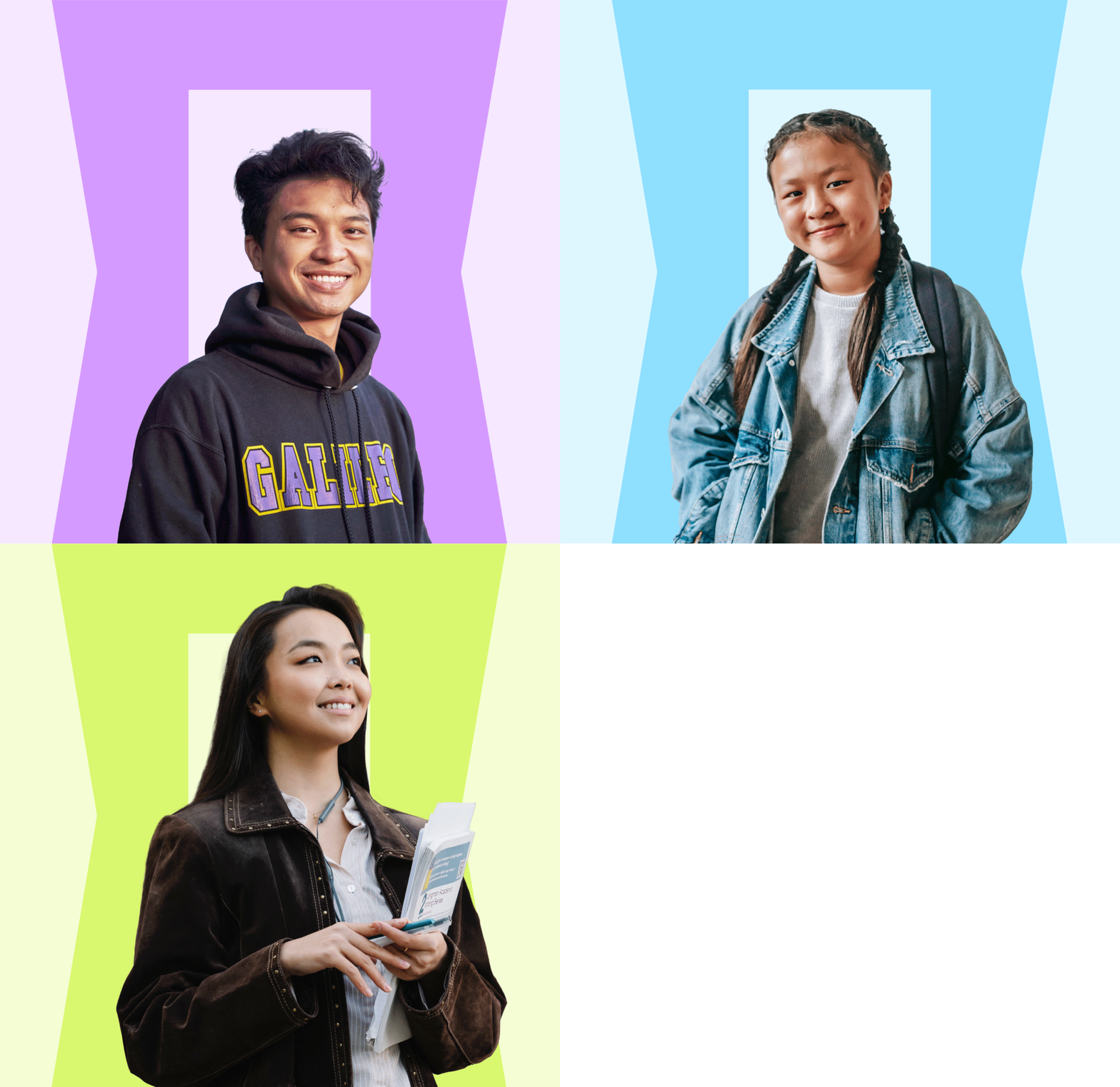
Photography Selection
Typography
Website Navigation & Architecture
ABOUT THE PROJECT
Opening doors for young people in South Hayward.
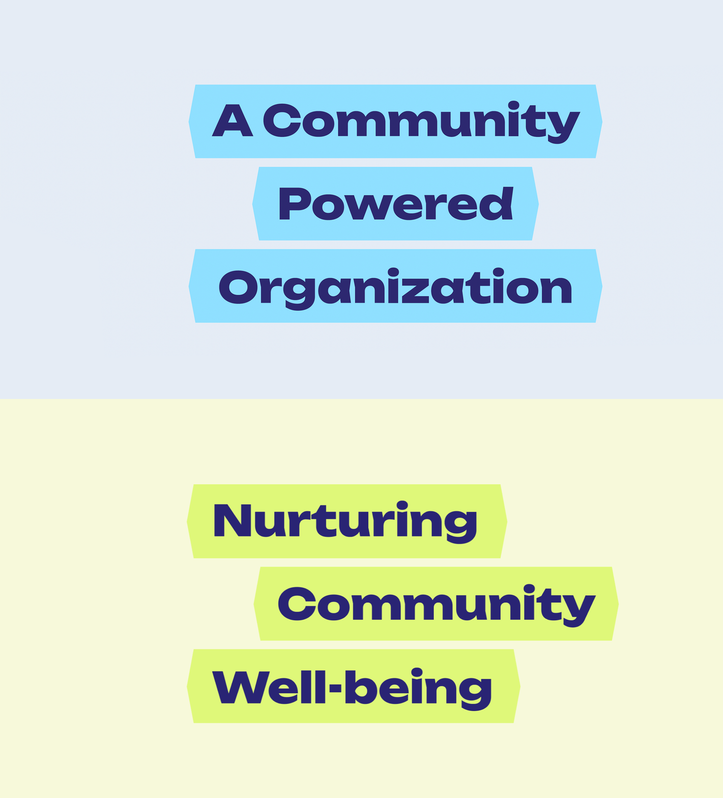
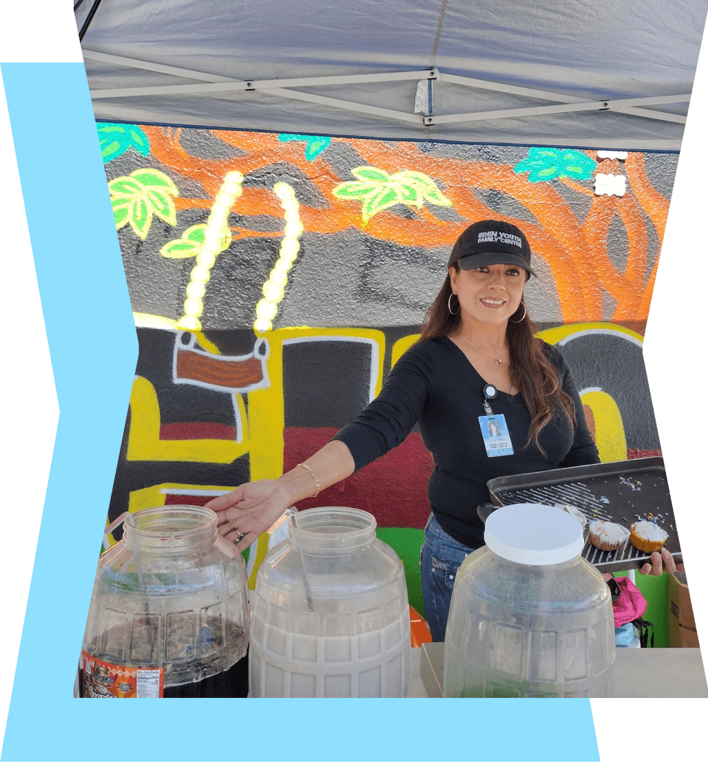
As the lead project and designer for Eden Youth, working at Good Stuff, the intention was to not only create a solid brand identity that positioned them where they are today but where they're headed. Eden Youth protects and nurtures the well-being of their community by providing holistic support and creating a safe space for everyone to heal and thrive.
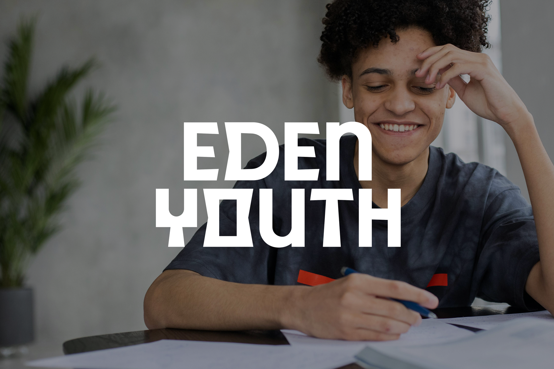
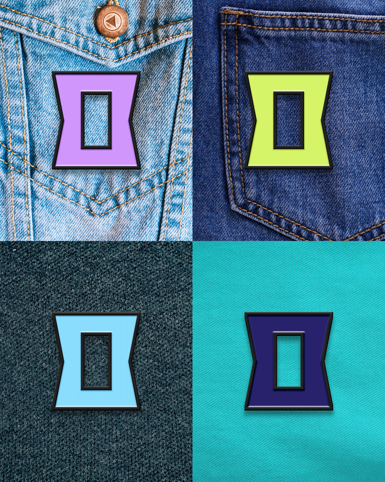
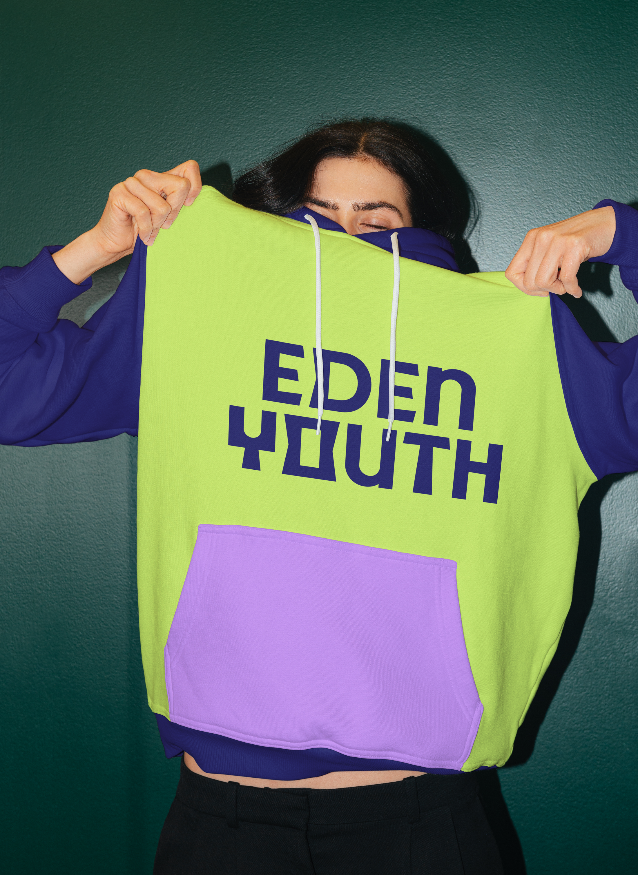
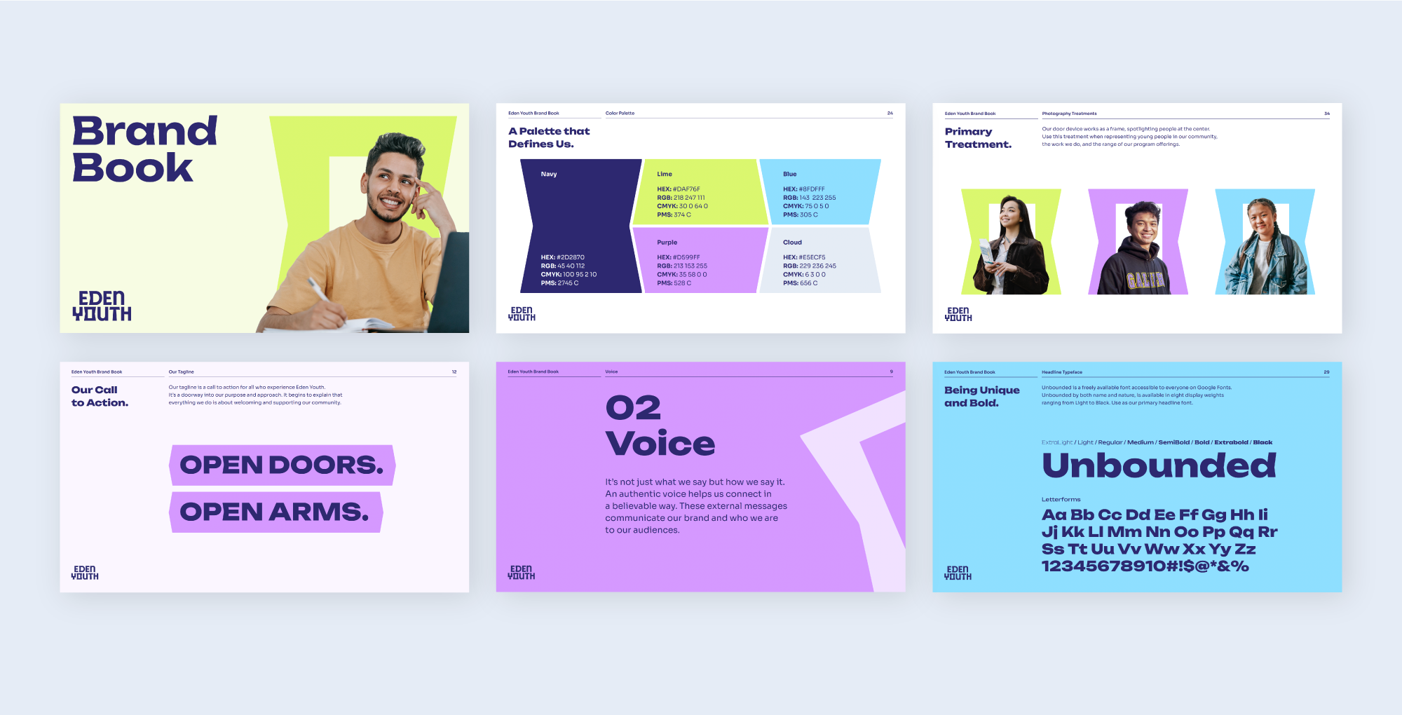
With this in mind, the identity was approached with welcoming at the forefront, representing a doorway within the 'O' in Youth. A custom typeface was developed with fun angled cuts that echo the diversity and individuality of each community member, creating a unique and memorable logo mark.
Before
After
BRAND IDENTITY
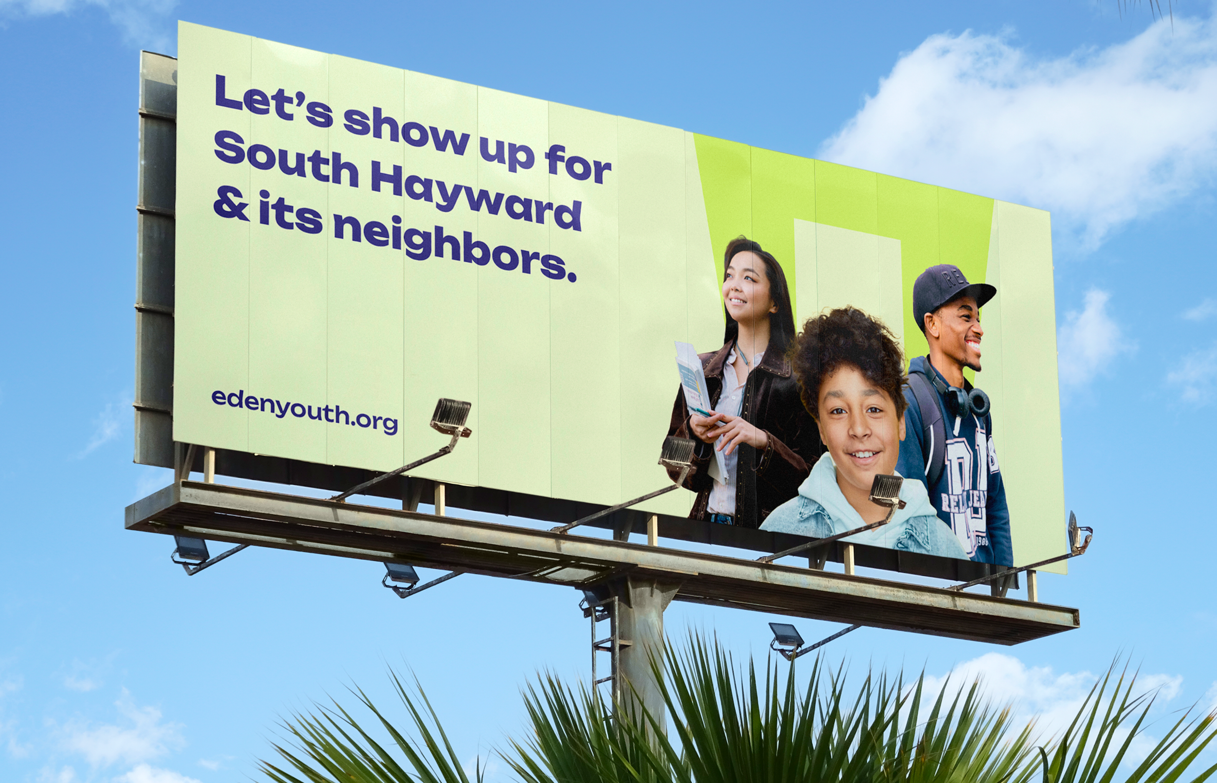
For the colors, a deep navy grounds the swatches of cool and vibrant tones. This played up the energy and creativity of the young people they serve and the deep-rooted history of their organization. While crafting the identity, the tagline 'Open Doors. Open Arms’ was developed. This allowed the expansion of messaging that captured everything they do, from healing and prevention to education in the arts and technology, mentorship, advocacy, and community engagement. It was important to capture all the services they provide to their community, with language that was easy to understand and carried an emotional hook.
Website design and functionality by Abraham Orozco, Good Stuff Partners
WEBSITE & BRAND EXPERIENCE
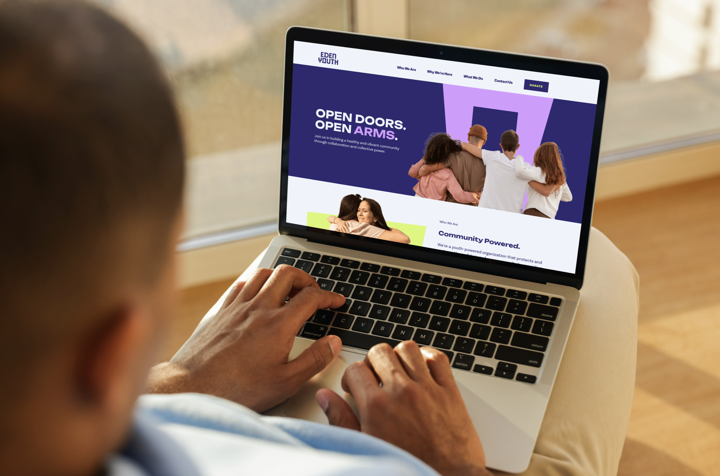
Every touchpoint on the website had clear messaging, communicated what they believe and stood for, and read in a conversational, inviting, and nurturing tone. The new brand look & feel was embedded through every component, ensuring consistent hierarchy and digestible bites of content with pops of visuals, graphics, and color connected to the angles and modularity of their unique and custom word mark.
Accessibility testing was crucial in the website development, engaging a wide range of audiences and people throughout their community. I developed a simple and storied approach to their navigation system, clearly stating who they are, why they're here, what they do, and how to contact and get involved. Their humility and empathy come through in every aspect of what they do, and they continue to make a profound impact in their local community, expanding their doors and welcoming more opportunities every day.
Help them continue to make an impact and provide a safe, creative, healing space for people in their community at edenyouth.org


